bedside table talk
Saturday, apr. 12, 2008 | 0 comments
Update! Thanks so much for all your suggestions! Everyone had such smart ideas for what we should do with these tables, and Keith even sent a link to Colourlovers, which as he said, lets you “upload a picture and it will analyze the colors in the picture and
create a design palette out of them,” pow!
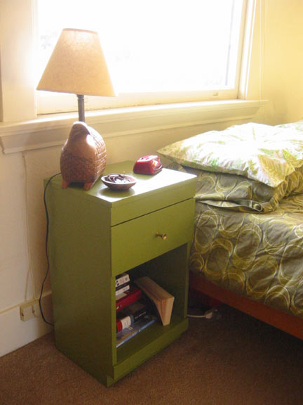
But after all the hemming and hawing and palette analysis, we ultimately gave in to the tractorbeam pull of proximity and went with the green paint we already had on hand after the great credenza paint off, and I think it looks pretty okay! Not too shabby (chic)…
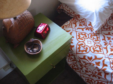

You probably can’t quite see it, but rest assured that both bedside clocks have been carefully adjusted to the exact same time. Can you guess who took the time to time things so perfectly? (Marco.)
Best of all, we can always paint right on over the green if and when we get sick of it, yay for non-permanent decision-making!
- – - – - – - – -
Marco and I just bought two bedside tables on Craigslist for forty little dollars!

And while we’re very happy with the ability to finally store things away in a drawer (a surprisingly big relief, what with Marco’s Swatch watch always trying to tick me to death), and we’re both in love with the new tables’ dainty footprint, we’re not so happy with the color.
Actually the color isn’t really the problem, it’s more the country-cutesy distressing along the edges that we’re not so crazy on. And if we’re going to repaint, that opens up a whole world of colorful opportunities, a freedom of choice that has left us feeling somewhat boggled.
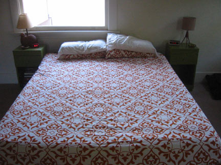
Do we worry about trying to select a color that complements our rough low-thread-count Ikea bedding? If so, whatever color we choose will also have to mesh with the very green green of our other main duvet cover (purchased at one of those gargantua Anthropologie sales):

Or, since bedding is typically more temporal than paint jobs, should we just boldly go forth in an entirely new color direction, untethered by concerns of matchy-matching? With all boundaries removed, the color I keep coming back to is a deep-greenish sea turquoise. Or a burnt orange. Or maybe a nice, comfortable olive green? Basically any of the bold, beautiful colors found in my new favorite handbag (Sale! Zara!):

But maybe matching the bedside tables to the purse isn’t the best idea? Possibly those colors don’t translate too terribly well to furniture? Which means we’ll find ourselves sick of them the second the last coat of paint dries? Wait, do we even have to paint both tables the same color? Perhaps we should double our trouble and select two totally different colors?
What do you think? Please, help my brain think!
Comments
New Comment